
Decorating with Color: Understanding Undertones, Temperature, and Flow Between Rooms

Key Takeaways
- Undertones - the subtle secondary hue in any paint color - determine whether colors look harmonious or clash in practice.
- A room's light source dramatically shifts how paint colors appear throughout the day.
- Color temperature (warm vs. cool) affects how a space feels emotionally, not just visually.
- Flow between rooms comes from shared undertones or temperature, not necessarily matching colors.
- Testing large paint swatches in your actual space is the most reliable step before committing.
Why Color Feels Inconsistent (Even When You Like Each Color Separately)
Most decorating frustration doesn't come from choosing bad colors - it comes from choosing colors without a shared framework. A dusty blue accent wall that looked stunning in a showroom can feel cold and disconnected in your living room. A warm terracotta you loved in a magazine can look muddy next to your existing flooring. The colors themselves aren't wrong; the relationship between them is.
Color doesn't exist in isolation. It is always experienced in relation to adjacent surfaces, light sources, and the colors that surround it. This is why a cohesive color strategy requires understanding three core concepts: undertones, temperature, and flow - the building blocks that determine whether a palette feels pulled together or accidental.
If you're starting from scratch with decorating, this introduction to interior decorating covers the foundational vocabulary and first steps that will give color decisions meaningful context.
Understanding Undertones: The Hidden Hue Beneath the Surface
Every paint color contains two layers of identity: the dominant hue (the color you see first - blue, gray, green) and the undertone (the secondary hue lurking beneath it). A gray paint might carry a blue undertone, a lavender undertone, or a green undertone. A beige might lean pink, yellow, or orange. These undertones become visible when placed beside other colors, and they are the primary reason colors that look fine individually can clash terribly together.
Undertones matter most when your paint will live alongside fixed elements you can't change - hardwood floors, tile, granite countertops, brick, or existing cabinetry. A gray with a strong blue undertone will feel cold and slightly off next to warm honey-toned wood floors. A white with a yellow undertone will clash with bright white trim. Identifying undertones before you commit prevents these common mistakes.
Undertones Don't Lie - But Labels Can Mislead
A paint labeled 'warm gray' can still carry a strong purple or green undertone that clashes with your wood floors or cabinetry. Never rely solely on the name or marketing description of a color. Look at the actual chip under your home's light conditions and beside your existing finishes before making a commitment.
To identify an undertone, hold a color chip against a few reference colors: crisp white paper, your flooring, your largest piece of upholstered furniture. The undertone will assert itself in contrast. For a deeper look at how this plays out specifically with neutral wall colors, see our guide on warm-toned vs. cool-toned neutrals.
When testing paint swatches, paint at least a 12×12-inch patch directly on the wall and observe it for a full 24 hours before deciding - morning light, midday light, and evening lamp light will all read differently.
Small paper chips viewed in a store cannot replicate how your actual wall surfaces, flooring, and existing furnishings interact with color in your specific space.
If you're uncertain about undertones, hold a white piece of paper next to your paint swatch: the undertone will reveal itself immediately by contrast.
The human eye struggles to see undertones in isolation, but a neutral white reference eliminates that ambiguity and makes subtle pink, green, or yellow undertones unmistakable.
Warm vs. Cool: How Temperature Shapes a Room's Mood
Color temperature refers to whether a color sits on the warm (red, orange, yellow) or cool (blue, green, violet) side of the spectrum. This temperature carries genuine psychological weight: warm colors tend to feel energizing, intimate, and advancing - they make spaces feel smaller and cozier. Cool colors tend to feel calming, airy, and receding - they make spaces feel larger and more open.
Neither is objectively better; the right temperature depends on how you want a room to feel and how it is already lit. A north-facing room that receives only indirect, cooler light will feel cold and flat painted in a cool blue-gray. Adding a warm greige or soft terracotta instead compensates for the light's coolness and keeps the room feeling comfortable. Conversely, a south-facing room bathed in intense afternoon sun can handle cooler tones that soften the glare.
Temperature also guides furniture and accent choices. A room painted in warm tones pairs naturally with wood furniture, amber lighting, and earthy textiles. Cool-toned rooms feel at home with stone surfaces, metals in silver or brass, and linen or cotton fabrics. Mixing temperatures deliberately can work - but it requires understanding why you're doing it, not just doing it by accident. See how these decisions also shape visual balance across a room.
How Light Transforms Every Color You Choose
Light is the single most powerful variable in how color behaves on a wall. The same paint chip can look like two completely different colors depending on whether a room faces north, south, east, or west - and whether it's lit by incandescent bulbs, LED daylight bulbs, or fluorescent overhead lighting.
90%
Of snap judgments about spaces are color-based
Research in environmental psychology suggests color is among the first and most influential factors people use to assess a room's feel.
3-4 hrs
Time for paint color to shift significantly in natural light
A single paint color can appear noticeably warmer in morning eastern light and cooler under afternoon northern or western light, changing its perceived undertone.
- North-facing rooms receive indirect, cool, bluish light all day. Colors here appear cooler and more muted, which can make cool tones feel stark and warm tones feel most balanced.
- South-facing rooms get strong, warm light most of the day. This amplifies warm undertones and can wash out pale colors - bolder or cooler choices often hold up better.
- East-facing rooms are warm and bright in the morning but shift cooler in the afternoon.
- West-facing rooms are cool and dim in the morning but glow warm in late afternoon and evening.
Artificial light adds another layer. Incandescent and warm LED bulbs amplify yellow and orange undertones. Daylight or cool-white LEDs reveal blue and green undertones. Before finalizing any color, observe your test patches under the actual light conditions your room experiences - both natural and artificial.
Since lighting setup itself is a major part of how color reads in a room, it's worth understanding how layered lighting affects mood and color perception before making final paint decisions.
Sample Before You Commit
Before purchasing full gallons, buy sample-size pots of your two or three shortlisted colors and paint large rectangles on the actual walls you plan to change. Live with them for at least two days across different times of day and lighting conditions. This small upfront step prevents costly repaints.
Creating Flow Between Rooms Without Matching Everything
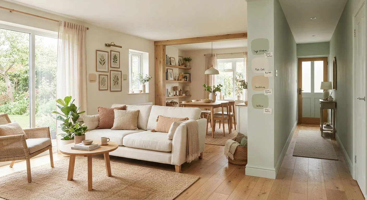
Open floor plans and sightlines between rooms create a design challenge: how do you make adjacent spaces feel distinct without making them feel disconnected? The answer lies in shared undertones or temperature, not identical colors.
A living room in warm sage green can transition naturally into a dining room painted a soft warm terracotta - they're different colors at different intensities, but both carry warm undertones, so the eye reads them as part of the same family. The transition feels intentional. Contrast that with placing a cool gray next to a warm beige: even if both are neutrals, their opposing undertones create visual friction.
Practical strategies for achieving flow include:
- Choose a shared undertone anchor - decide early whether your home's overall palette will lean warm or cool, and select all colors within that temperature family.
- Use a consistent trim color throughout - the same white or off-white on baseboards, door frames, and crown molding acts as a unifying thread regardless of wall color changes.
- Graduate intensity, not temperature - lighter to deeper versions of related hues (e.g., blush to dusty rose to mauve) create flow without monotony.
- Reserve accents for within-room variation - let rooms differ in hue but stay consistent in temperature across the open plan.
For room-specific considerations beyond color, this room-by-room decorating guide walks through the functional demands of each space that should inform your palette choices.
Matching Color Chips to Existing Elements Is Unreliable
Paint chip colors are printed on flat, uncoated paper and look very different from a painted wall's sheen and texture. Trying to match chips to your sofa, flooring, or tile in a store setting often leads to disappointment. Always bring physical samples of your existing elements - a fabric swatch, a tile sample, or a cabinet door - when making final color decisions.
Putting It All Together: A Practical Color Planning Process
Approaching color selection as a process - rather than a series of individual decisions - leads to results that feel genuinely cohesive. Here's a sequence that works for most homes:
- Audit your fixed elements first. Note the undertones in your flooring, tile, cabinetry, and any large upholstered pieces. These set the palette's boundaries.
- Identify your home's dominant light exposure. Use this to determine whether warm or cool tones will feel most comfortable in your main living spaces.
- Establish an overall temperature direction - warm or cool - and apply it consistently across the open plan.
- Select a wall color anchor for each room within that temperature family, allowing variation in hue and depth.
- Choose a single trim color to run throughout the home as a visual connector.
- Test every shortlisted color as a large wall swatch in the actual room before purchasing full quantities.
This process won't eliminate all uncertainty - color has inherent subjectivity and the way it appears in your specific space is something only you can evaluate in person. But it removes the guesswork and replaces it with a framework grounded in how color actually behaves.
Sheen Level Also Affects Color Perception
The same paint color in a flat (matte) finish will appear softer and slightly darker than in a satin or semi-gloss finish. Higher sheens reflect more light, which can intensify undertones and brighten a color noticeably. Factor finish into your decision alongside the color itself.
For the broader design principles that make color decisions land well - including how to balance visual weight across surfaces - see our guide on visual balance in home decorating. And if you're managing this as part of a larger home improvement effort, the Home Improvement hub covers practical renovation and upgrade guidance across every part of the home.
“Color is never seen as it really is - as it physically is. This fact makes color the most relative medium in art.”
— Josef Albers, Influential color theorist and author of 'Interaction of Color'