
Warm-Toned Neutrals vs. Cool-Toned Neutrals: Picking the Right Palette for Your Walls

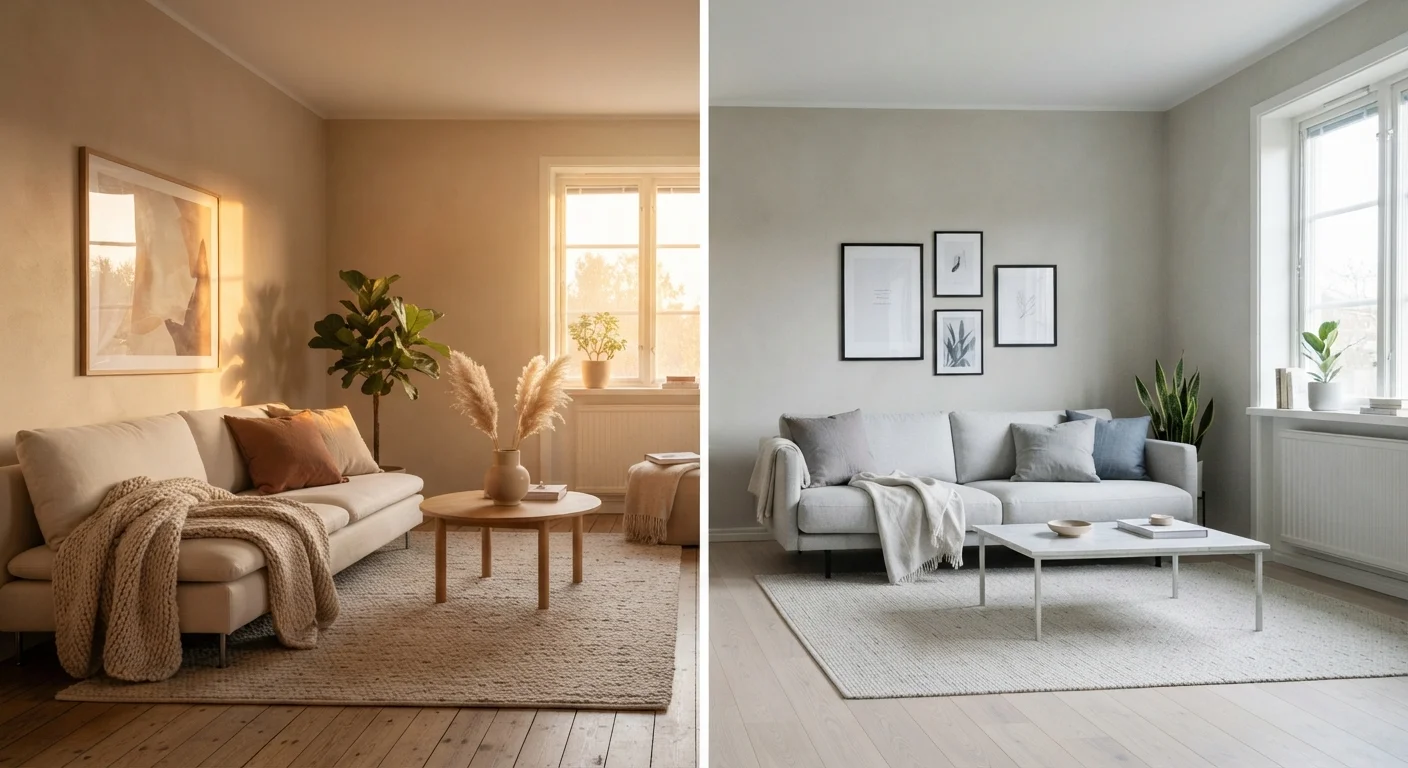
Key Takeaways
- Warm neutrals contain yellow, red, or orange undertones; cool neutrals lean toward blue, green, or violet.
- Natural light direction strongly influences how a neutral reads on your walls throughout the day.
- Greige and beige are not interchangeable - greige blends gray and beige and often reads cooler.
- Existing fixed elements like flooring, cabinetry, and trim should guide your undertone choice.
- Testing paint samples on actual walls in your space is the only reliable way to confirm a color before committing.
Option A
Warm-Toned Neutrals
The cozy, grounding classic.
Best for: Rooms with cool or limited natural light that need visual warmth and an inviting, lived-in feel.
Option B
Cool-Toned Neutrals
The crisp, airy modern choice.
Best for: Bright, south- or west-facing rooms where you want a clean, spacious, and contemporary atmosphere.
If your room faces north or receives little direct sunlight
Warm-Toned Neutrals
North-facing rooms skew blue-gray naturally. A warm beige or creamy white counteracts that chill and keeps the space feeling inviting rather than dreary.
If your room faces south or floods with bright afternoon sun
Cool-Toned Neutrals
Strong sunlight amplifies warmth, so a cool greige or soft gray prevents walls from looking yellow or orange and maintains a fresh, balanced tone.
If your flooring is golden oak, honey pine, or warm wood
Warm-Toned Neutrals
Matching undertones creates visual harmony. A warm wall color pulls the floor and walls into the same family rather than creating an unintended clash.
If you have gray or espresso flooring and white trim
Cool-Toned Neutrals
Cool-toned walls complement gray and dark wood tones naturally and keep the palette cohesive without adding competing warmth.
If you want maximum flexibility for future furniture and accessory changes
Cool-Toned Neutrals
Cool neutrals tend to work as a quieter backdrop across a broader range of accent colors, making it easier to swap decor over time without repainting.
What Actually Makes a Neutral 'Warm' or 'Cool'?
Every paint color - even a near-white or a basic beige - has an undertone, a subtle secondary hue that shifts the way the color reads to the eye. Warm neutrals carry undertones of yellow, orange, red, or golden brown. Cool neutrals carry undertones of blue, green, gray, or faint violet. On a tiny paint chip under fluorescent store lighting, the difference can be nearly invisible. On an entire wall in your home, it defines the entire mood of the room.
Take the often-confused pair of beige and greige. Beige is a warm neutral - its creamy, yellow-adjacent undertone gives rooms a classic, cozy character. Greige, a portmanteau of gray and beige, typically leans cooler because its gray component pulls the hue away from warmth. Some greiges sit almost exactly in the middle, while others tip decisively one way or the other. You cannot tell which category a greige falls into without testing it in context. For a deeper look at how undertones interact across a whole home, see the guide to undertones, temperature, and room flow.
| Criterion | Warm-Toned Neutrals | Cool-Toned Neutrals |
|---|---|---|
| Undertone family | Yellow, orange, red, golden | Blue, green, gray, violet |
| Common examples | Beige, cream, warm taupe | Greige, soft gray, cool white |
| Best light exposure | North- or east-facing rooms | South- or west-facing rooms |
| Mood and atmosphere | Cozy, grounded, intimate | Crisp, airy, spacious |
| Works with warm wood floors | Naturally harmonious | Can clash without care |
| Works with gray or dark floors | May feel mismatched | Naturally harmonious |
| Under warm artificial light | Deepens; can read orange | Balances; stays neutral |
| Decor flexibility over time | Suits warm accent palettes | Broader accent color range |
How Light Exposure Changes Everything
Light is the single biggest variable in how a neutral performs on your walls. The direction your room faces and the quality of light it receives throughout the day will shift a neutral's apparent color dramatically - sometimes by several shades.
- North-facing rooms receive indirect, bluish-gray light all day. Warm neutrals help compensate, adding visual temperature that the room lacks naturally. Cool neutrals can turn these spaces feel stark or flat.
- South-facing rooms get strong, warm sunlight for most of the day. Warm neutrals can read as orange or muddy under this light. Cool neutrals stay balanced and calm.
- East-facing rooms are bright and warm in the morning, then shift cooler by afternoon. Either palette can work, but test samples at both times of day before deciding.
- West-facing rooms are cool in the morning and flood with amber light in the evening. A cool neutral is often safer here to avoid an overwhelming yellow-orange effect at sunset.
~60%
Of perceived wall color comes from light
Color science research consistently shows that lighting conditions - natural and artificial - account for the majority of how a painted surface reads to the human eye.
3-5
Sample swatches recommended before committing
Interior design professionals generally advise testing at least three to five candidate colors as large wall patches before purchasing a full gallon of paint.
Artificial lighting adds another layer. Incandescent and warm LED bulbs amplify warm undertones further. Cool-white LED or daylight bulbs can make warm neutrals appear more balanced but can also push cool neutrals toward blue-gray. If your room is frequently lit artificially - a basement, an interior bathroom, or a home office used at night - test your paint sample under the actual light source you'll be using.
Reading Your Room Before Choosing a Side
Before you open a paint deck, take stock of the fixed elements in your room - things you are not repainting or replacing anytime soon. These are your anchor points.
- Flooring: Warm-toned wood floors (honey, golden oak, or amber) pair naturally with warm neutrals. Gray tile, slate, or dark espresso wood typically harmonize better with cool ones.
- Trim and millwork: Most builder-grade trim is a warm white with yellow undertones. If your trim has a cool, blue-white cast, pairing it with a warm-toned wall can create an unintended contrast.
- Cabinetry (in kitchens and baths): Cream-colored or raised-panel wood cabinets favor warm walls. Flat-front gray or white shaker cabinets often pair more naturally with cool neutrals.
- Furniture you already own: Leather sofas, aged brass fixtures, and warm textiles tip the scales toward warm palettes. Upholstered pieces in charcoal, navy, or natural linen tend to complement cool ones.
When a Neutral Sits Right in the Middle
Some neutrals are deliberately formulated to be undertone-neutral - sitting so close to the middle of the warm-cool spectrum that they shift depending entirely on surrounding light and decor. These so-called 'chameleon' colors can be versatile but are also the most unpredictable to test. If you find a paint chip that looks different every time you pick it up, that is a sign you are looking at one of these mid-tones. Test them especially carefully under all lighting conditions your room experiences before committing.
Once you've identified your room's undertone leanings, narrow your paint options to a small shortlist and test real samples. Purchase the smallest available size of each candidate color and brush a large swatch - at least 12 by 12 inches - directly on the wall. Observe it at different times of day and under your usual artificial lighting before committing. No online preview, app, or paint chip can substitute for this step.