
Colour Coordination Without a Colour Wheel: Simple Principles for Everyday Outfits

Key Takeaways
- Neutrals anchor any outfit and pair effortlessly with almost every other colour.
- Matching the temperature of your colours - warm with warm, cool with cool - is one of the simplest coordination shortcuts.
- Varying the depth of colour (light, mid, dark) within an outfit adds dimension without complexity.
- A single accent colour kept consistent ties a whole look together.
- You don't need a full colour theory education - just a handful of reliable principles applied consistently.
Colour Coordination
Colour coordination is the practice of choosing clothing colours that look intentional and harmonious together. It doesn't require memorising a colour wheel or studying design theory - it's about recognising a few repeatable patterns that reliably work. When colours feel like they belong in the same outfit, that's coordination doing its job.
In design, harmony is often explained through hue relationships (complementary, analogous, triadic), but for everyday dressing, tone and value - how light or dark a colour is, and whether it reads as warm or cool - are the most practical tools.
Why Colour Feels Complicated (and Why It Doesn't Have to Be)
Most people learned about colour wheels in art class and then promptly forgot them - understandably so. The gap between complementary colour theory and actually getting dressed in the morning is enormous. The good news is that practical colour coordination relies on just a few observable principles, not a design degree.
The goal isn't to engineer a perfect palette. It's to avoid combinations that feel accidental and build ones that feel settled. Once you recognise two or three repeatable patterns, dressing with intention becomes almost automatic. For context on how colour trends travel from forecast to closet, see how seasonal colour stories develop - but trends are optional input, not rules.
Colour Rules Are Descriptive, Not Prescriptive
The 'rules' of colour coordination describe what tends to look harmonious to most people - they aren't laws. Personal style, cultural context, and individual preference all shape how colour reads. These principles are tools, not requirements, and breaking them deliberately can be just as effective as following them.
The Neutral Foundation Principle
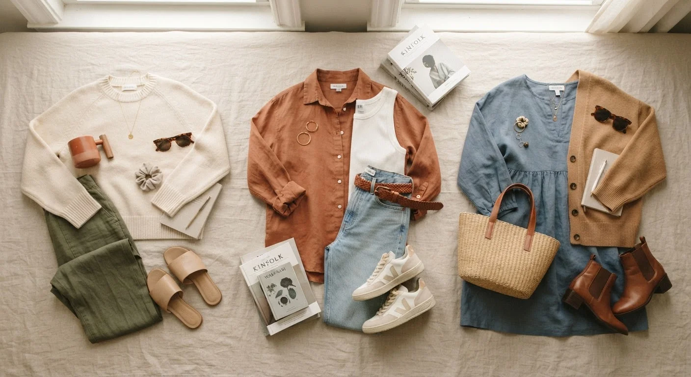
The single most useful coordination tool most people already own is a wardrobe stocked with neutrals. Black, white, grey, navy, camel, and cream pair reliably with almost every other colour because they carry little competing visual information. They let one intentional colour lead.
If you're unsure where to start building this kind of base, neutrals as a wardrobe strategy explains exactly why these pieces form the backbone of mix-and-match dressing. The practical upshot: if two-thirds of your outfit is neutral, the remaining third can be almost any colour without clashing.
62-90%
Influence of colour on snap judgements about products
Research published in the journal Management Decision suggests colour accounts for a substantial portion of initial aesthetic judgements, though exact figures vary by context and study.
5-6
Typical wardrobe neutral pieces recommended by stylists
Style educators commonly suggest that five to six core neutral pieces (white shirt, dark denim, black trousers, grey knitwear, camel coat, navy blazer) enable the majority of a functional, mix-and-match wardrobe.
Temperature Matching: Warm with Warm, Cool with Cool
Every colour has a temperature - it reads either warm (leaning toward yellow, orange, or red) or cool (leaning toward blue, green, or purple). Outfits tend to feel more cohesive when you keep colours in the same temperature family. A rust-orange top with olive trousers works because both are warm. A slate-blue shirt with charcoal grey trousers works because both are cool.
This principle also applies to neutrals. Cream is a warm neutral; pure white is cool. Camel is warm; true grey is cool. Mixing temperatures isn't a style crime, but when an outfit feels slightly 'off' and you can't identify why, mismatched temperatures are often the culprit. Swapping one piece for a same-temperature alternative frequently resolves it.
Check Undertones in Natural Light
Artificial store lighting can make colours appear warmer or cooler than they actually are. When pairing pieces you already own, lay them together near a window in daylight to assess whether their undertones feel harmonious. This one habit catches most 'almost right but slightly off' combinations before they leave the house.
Light, Mid, Dark: Playing with Depth
Another low-effort coordination shortcut is varying the depth - or value - of colours within a single outfit. Pairing a light shade with a mid-tone and a dark tone (or any two of those three) creates visual interest without requiring multiple different colours. Pale blue, medium chambray, and deep navy is essentially one colour doing three things at once.
This is the logic behind monochromatic dressing, which consistently reads as polished. It also works with neutrals: cream shirt, taupe trousers, chocolate brown boots is a three-piece look built entirely from depth variation within a warm-neutral family. For a wider set of outfit structures built on this kind of logic, outfit formulas that remove the guesswork offers reliable starting points across seasons and occasions.
The One-Accent Rule
When you want to introduce a genuine colour - a cobalt, a terracotta, a forest green - the simplest framing is to treat it as the single accent in an otherwise neutral or tonal outfit. One accent colour, repeated at most twice (once in a top, once echoed in a bag or shoe), gives a look coherence without visual competition.
This is also where pattern mixing becomes approachable. If a patterned piece already contains several colours, pulling one of those colours into a solid second piece ties the look together. mixing patterns without the guesswork explores exactly this principle - using colour as the connective thread between different prints.
Colour coordination, at its most practical, is about reducing decisions rather than multiplying them. A neutral base, temperature awareness, depth variation, and one consistent accent colour cover the vast majority of everyday dressing situations - no colour wheel required.
“Colour is ultimately about feeling. When a combination resonates with you - when it feels settled rather than restless - that's the only confirmation you need that it's working.”
— Tim Gunn, Fashion educator and author