
Interior Design Styles Decoded: A Plain-Language Reference for Common Aesthetics

| Scandinavian palette | White, light grey, birch, pale oak - warm but restrained |
| Minimalist rule of thumb | If it doesn't serve a purpose or bring genuine joy, remove it |
| Mid-century modern era | Approximately 1945-1969 |
| Japandi origin | Fusion of Japanese wabi-sabi and Scandinavian hygge principles |
| Industrial hallmark materials | Exposed concrete, steel, brick, and reclaimed wood |
| Boho defining trait | Layered global textiles, natural materials, and handcrafted pieces |
Why Design Style Labels Actually Matter
Walking into a furniture store or scrolling through a home décor feed, you'll encounter terms like Scandinavian, transitional, japandi, or maximalist thrown around freely - often without explanation. These labels aren't just marketing language. They describe real, consistent sets of principles: the colors, materials, proportions, and moods that make a room feel coherent.
Knowing what a style actually means gives you a practical advantage. It helps you identify what you already love in your space, communicate your vision when working with others, and avoid buying pieces that work against each other. You don't have to commit to one aesthetic entirely - most homes are a blend - but understanding each one on its own terms is the clearest starting point.
If you're just beginning to think about décor, the introduction to interior decorating covers the foundational vocabulary worth knowing before diving into style specifics.
Wabi-sabi
A Japanese philosophy that finds beauty in imperfection, impermanence, and natural materials. In interior design, it translates to embracing worn textures, handmade objects, and organic forms over perfect finishes.
Hygge
A Danish and Norwegian concept describing coziness, comfort, and a sense of well-being. In interiors, hygge is expressed through soft lighting, tactile textiles, and spaces that feel warm and inviting.
Negative space
The intentionally empty area around and between objects in a room. In minimalist and japandi design, negative space is considered an active design element that gives the eye room to rest.
Transitional style
An interior design approach that blends traditional furniture forms with contemporary lines and finishes. The result is a balanced look that avoids feeling dated or overly trend-driven.
Organic shapes
Forms that echo nature - curved, irregular, or asymmetrical rather than strictly geometric. Common in mid-century modern and japandi design, often seen in chair backs, lighting fixtures, and decorative objects.
Reclaimed wood
Lumber salvaged from old structures such as barns, warehouses, or factories. Its weathered appearance and history make it a popular material in industrial and bohemian interiors.
Eight Common Styles and What Defines Each One
The styles below represent some of the most commonly referenced aesthetics in US home design. Each summary covers its core visual logic, typical materials, and the feeling it aims to create.
| Scandinavian palette | White, light grey, birch, pale oak - warm but restrained |
| Minimalist rule of thumb | If it doesn't serve a purpose or bring genuine joy, remove it |
| Mid-century modern era | Approximately 1945-1969 |
| Japandi origin | Fusion of Japanese wabi-sabi and Scandinavian hygge principles |
| Industrial hallmark materials | Exposed concrete, steel, brick, and reclaimed wood |
| Boho defining trait | Layered global textiles, natural materials, and handcrafted pieces |
Scandinavian
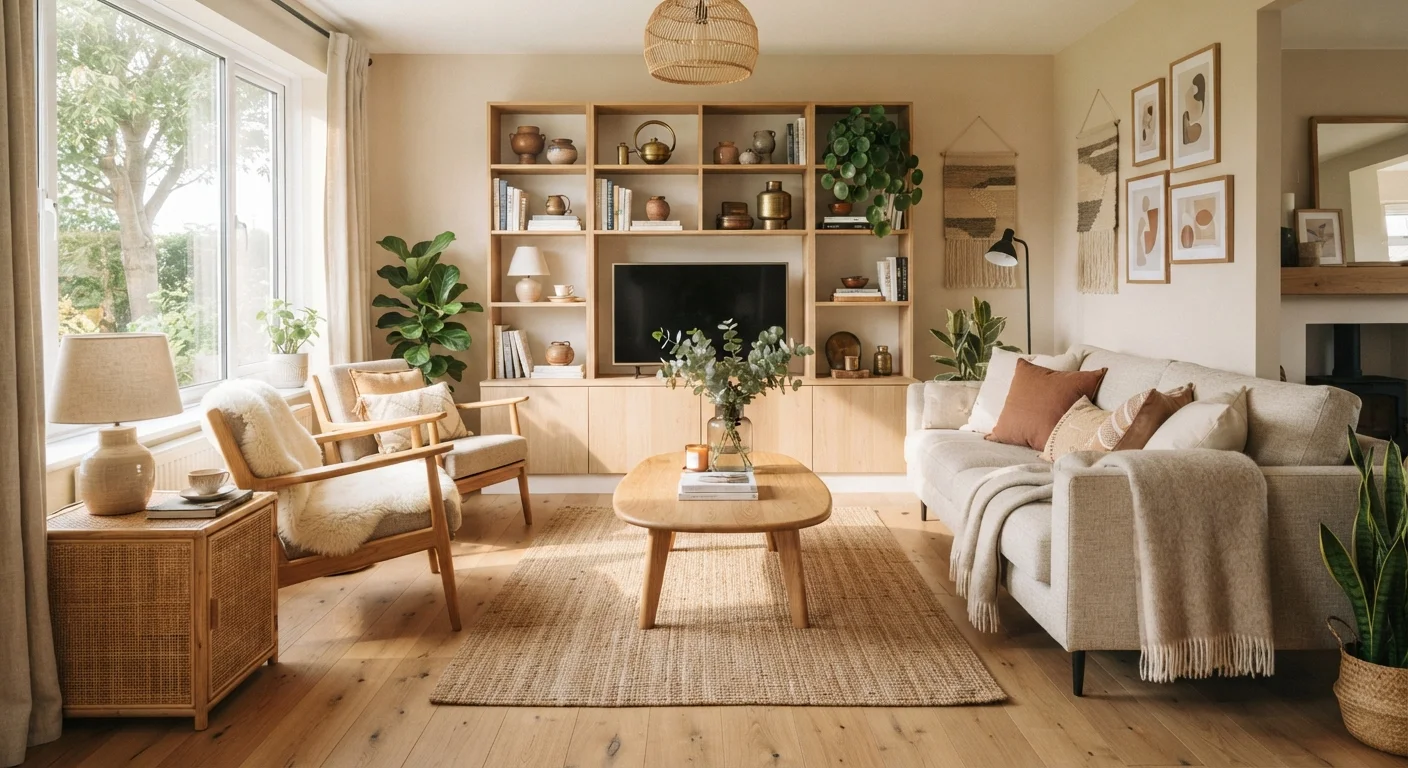
Originating in Nordic design traditions, this style prioritizes simplicity, function, and warmth. Expect light wood tones (birch, pine, oak), white or pale grey walls, minimal ornamentation, and cozy textiles like wool throws and sheepskin. Clutter is avoided, but the space never feels cold - softness comes through natural materials and layered textures rather than decoration.
Minimalist
Often confused with Scandinavian, minimalism takes restraint further. The guiding principle: only what is necessary remains. Furniture is low-profile, lines are sharp, and the color palette is tightly controlled - often monochromatic. Negative space (empty wall and floor area) is treated as a design element in itself.
Maximalist
The deliberate opposite of minimalism. Maximalism embraces abundance, pattern, and layering. Bold colors, mixed prints, gallery walls, and collections displayed openly are all hallmarks. The key distinction from mere clutter is intentionality - every piece is chosen and placed with purpose. For a broader take on how this aesthetic is showing up across design and fashion, see the piece on maximalism versus quiet luxury.
Mid-Century Modern
Rooted in post-WWII American and European design (roughly 1945-1969), this style features organic shapes, tapered legs, and a marriage of form and function. Materials include teak, walnut, molded plywood, and fiberglass. Colors lean toward mustard, olive, burnt orange, and warm neutrals alongside avocado green.
Industrial
Inspired by repurposed urban loft spaces, industrial design foregrounds raw, unfinished materials: exposed brick, concrete floors, steel beams, and visible ductwork. Furniture tends toward dark metal frames and reclaimed wood. The palette is typically neutral - charcoal, black, raw wood tones - with very little softening.
Transitional
Transitional design sits deliberately between traditional and contemporary. It blends classic furniture silhouettes with cleaner, more current lines. The palette is typically neutral and balanced; patterns are present but not dominant. It's a style that ages gracefully and accommodates changing tastes - which explains its sustained popularity in American homes.
Bohemian (Boho)
Bohemian interiors are layered, eclectic, and globally influenced. Natural materials, handcrafted objects, plants, and mixed textiles create warmth and visual complexity. There's an intentional looseness to boho spaces - rules matter less than personality. Macramé, rattan, woven baskets, and vintage rugs are recurring elements.
Japandi
A hybrid of Japanese wabi-sabi and Scandinavian hygge sensibilities, japandi emphasizes calm, craftsmanship, and understated natural beauty. The palette is muted - warm beiges, soft greiges, and charcoal - and every object is chosen with care. Furniture is low, clean-lined, and built to last. Imperfection is welcomed rather than hidden.
Color plays a defining role across all of these styles. The guide to color undertones and room flow explains how to choose shades that feel right for whichever aesthetic you're working toward.
Applying Style Knowledge to Your Own Home
Most real homes don't fit neatly into one category - and they don't have to. Style labels are tools for clarity, not rules. The practical value is in using them to identify patterns in what you're drawn to, spot conflicts between pieces you already own, and communicate confidently when shopping or planning a refresh.
A useful exercise: browse images that appeal to you, then look for the shared traits. Are the rooms light or dark? Sparse or layered? Full of natural materials or polished surfaces? Those recurring elements point toward the principles you respond to - and that's a more reliable guide than any label.
Once you've identified a general direction, thinking room by room helps keep decisions grounded in how each space actually gets used. The room-by-room decorating guide walks through the functional requirements of each space so that style choices don't come at the cost of practicality.
Mixing Styles Is Normal - and Often Better
Professional designers rarely apply a single aesthetic without modification. Blending two complementary styles - such as japandi with minimalism, or transitional with mid-century modern - often produces spaces that feel more personal and livable than strict adherence to one label. Use style definitions as a vocabulary for understanding your preferences, not as a checklist to follow.